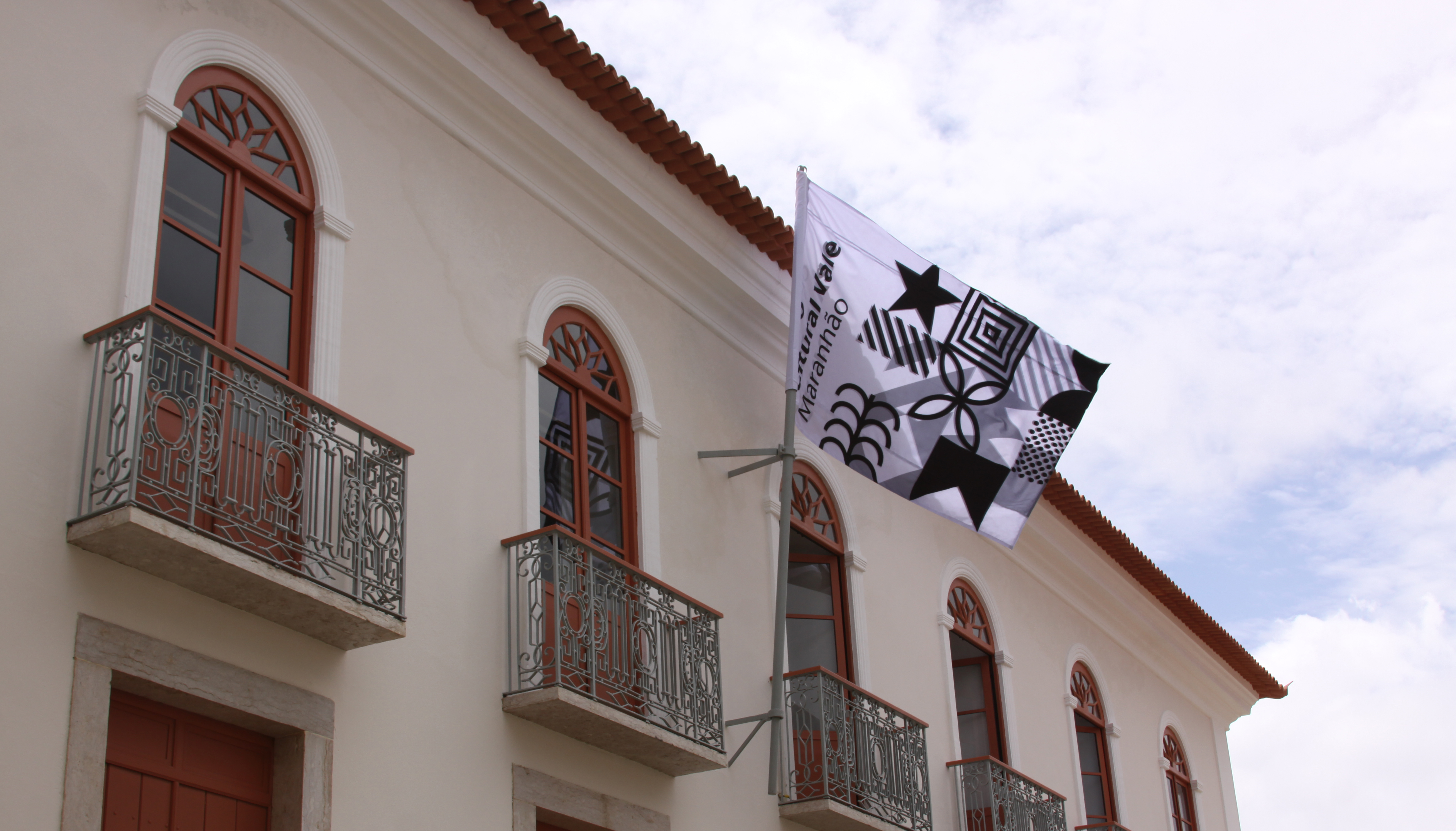
Coincidencia – Swiss & South American Cultural Exchanges
Client Pro Helvetia
Font Family Circular
Colors CMYK + Pantone + RGB
Technique Offset
Link coincidencia.net
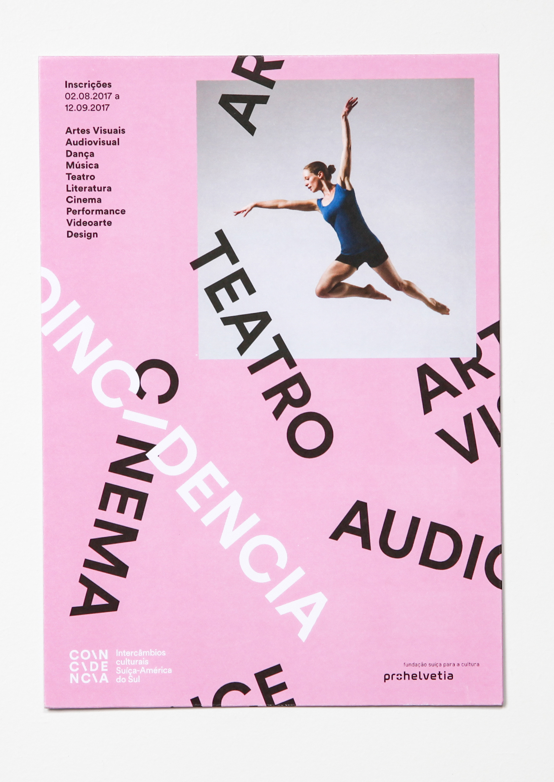
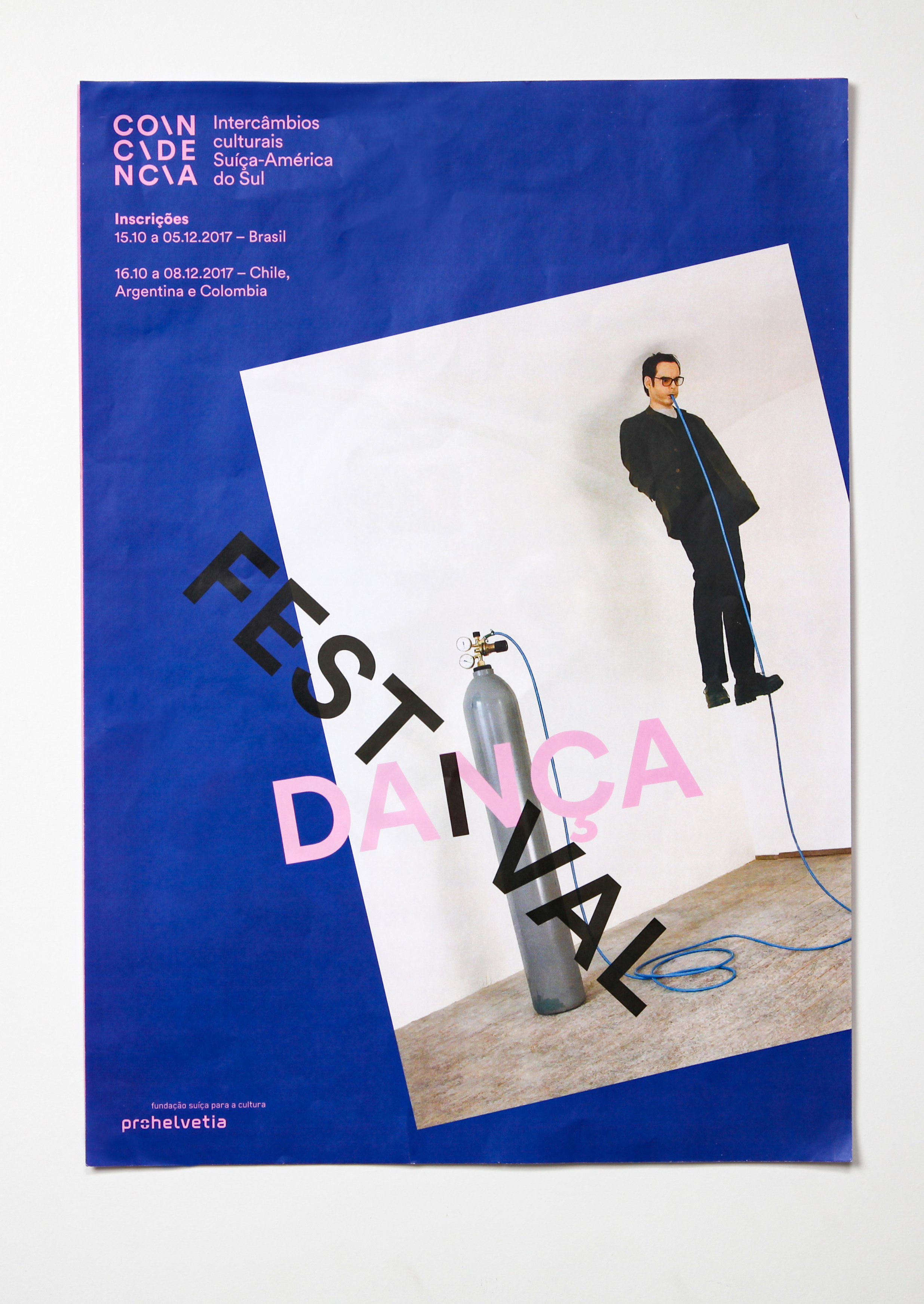
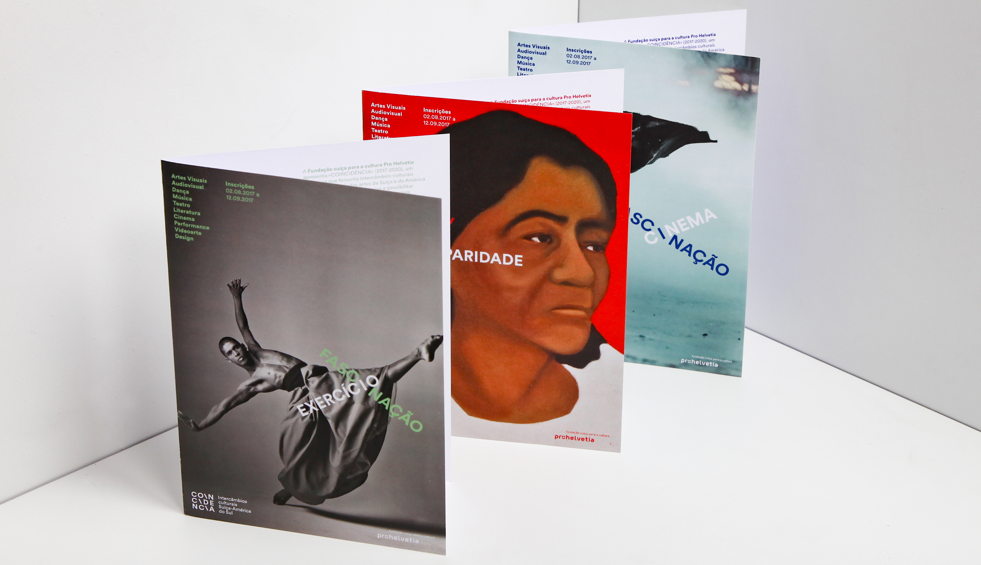
Project for the creation of the logo and visual identity for Coincidencia, a swiss organization Pro Helvetia’s program, developed to increase the exchange between artists from Switzerland and South America. The term “Coincidencia” refers not only to the points these two cultures (Swiss and South-American) share but also covers all “coincidences” between the different countries of South America and, somehow, also stresses Swiss diversity. When different events occur at the same time (coincidence), and if they are even slightly related to a similar topic or theme, then the importance and focus of this theme are enhanced, and, through the dialectic of coincident events, thinking and treatment on it can move forward. The project approach was to create something that relates to both Switzerland and South America, starting by the obvious, the swiss red cross, but looking at it as two overlapping rectangles. What came after was the application of this idea to typography, that means, the overlapping of two words. The letters “i” that appear in the word “coincidencia” where highlighted by making them left inclined. This same letter “i” became the preferred point for the overlapping of the words, thus forming the basic principle for the logo and visual identity of the program.