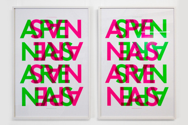
Apenas Arenas
Client Alexandra Prufer
Font Family LL Brown, by Aurèle Sack
Color Pantone Fluorescent
Paper Special Paper
Technique Screen Printing
Awards Distinction prize at Brazil's 10th Graphic Design Biennial + ISTD 2014 International Typographic Awards winner.
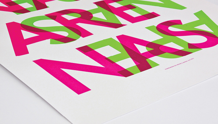
The poster created for the exhibition in homage to artist Edgardo Arenas, known as Arenas, graphically explores the overlap of two words: APENAS ARENAS [Just Arenas]. This is how his name was printed on the artist’s business card and this is the way he used to introduce himself. Silkscreen in a 66 x 96cm format, printed from a single screen in two different directions and colors, which causes overlap. Printing: Estúdio Elástico.


